 Think of Italy and most people connect that with delicious rich foods, beautiful architecture and marvelous history. I think some of that rubbed off on tarot decks if you consider what was made there since the Renaissance. A good example is the Tarocco Soprafino by F Gumppenberg in 1835, or its wonderful remake Soprafino Tarot by the Milanese boutique publisher Il Meneghello.
Did I spoil the fun by using ‘wonderful’ in the first paragraph? Well, perhaps, but there is plenty to tell about this deck other than the fact responses to pictures are usually “Oooh, beautiful” and “Aaah, want!”. The Soprafino Tarot by Il Meneghello comes in a hardcover box with a lid-lift top. The entire box is printed with tiny tarot cards from the deck itself and on top you have the actual World Card glued to it. The finishing touch is the red wax seal of Il Meneghello’s logo. (NB. Currently the deck is sold in a grey colored box with the World card. After a little research I found out this is still the 1st 1992 edition, they just changed the box.)
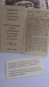
Numbered edition card and the historical information on the Soprafino Tarot
The extra’s
This is definitely a box in which you can store your cards and it looks good in any tarot cupboard. But the real fun begins when lifting off that lid of course. Inside you’ll find the deck, a numbered card that states the name (Tarocco Soprafino di F. Gummppenberg Milano 1835), the artist – Osvaldo Menegazzi – the publishing house and its number within the ‘limited’ edition of 2000 (Mine is number 791 of the 1992 edition).
The box does not contain a little white booklet (LWB), most likely because that wasn’t practice in 1835, so it isn’t now either. Instead there’s a one page leaflet the size of a tarot card telling you a bit about the history of the deck. One side has the Italian, the other a translation in English. Native speakers might smirk about the language used, but I don’t know…it sort of adds to the charm. And the info is interesting. There’s another sliver of paper inside to tell you that this is an item created by hand and any imperfections or variations should be considered an expression of the craftsmanship, not as mistakes.
200 year old quality
Since the borders are quite off center in most of the Soprafino Tarot, that ‘warning’ was a smart move. If this was anything other than a hand-made remake of an early 19th century deck I might be annoyed, but now I am not. So, more about the deck. The cards are smaller than in any deck I have seen so far, and I mostly mean that in width. In length they could be considered ‘normal’. They have excellent thick card stock, without it becoming too substantial or inflexible to shuffle. If anything this might be one of the best card stocks I have in my collection, because besides being obvious quality, it shuffles like a dream. And we all know how important that is! No rounded corners though, which worries me a bit; square corners get damaged easily. But they didn’t have them ‘back then’ and I think I might consider it an act of blasphemy to take out a corner-cutter.


The cups of the Soprafino Tarot. That Ace is very ‘Holy Grail’-ish.
The fact I have that feeling tells you the Soprafino Tarot, including its historical sense, was remade rather well. The most distinguishable about the whole do-over are the replicated blemishes and acid stains. For the life of me I couldn’t imagine being anything other than pissed or freaked out about stains on my tarot cards, but no…these stains and the type of paper used give me the feeling I am actually holding a 200 year old deck. And boy, if you want to give a historian some tarot porn, you do it like that! One of my favorite tarot cards, The Sun, is actually very blotched and I love it!
Realistic & rich
Tarot readers using reversals will be happy with the deck’s back. The Soprafino Tarot has a quite simple but elegant back. Off-white with petite dots in star-pattern on it, with no obvious top or bottom. Think vintage wallpaper.
The style of the Soprafino is very typical Italian Renaissance and after. It is an ancient Italian deck, but just reproduced by a 20th century-artist. Like I said: it is gorgeous. The people portrayed all look very realistic, although I did spy some of the same -or very similar – faces on a few of the females. And all of them seem to enjoy a good walk around Milan every now and then if you trust their rosy cheeks. The men can look a little grim at times. Guess they take their task as knight very seriously.


The Swords in the Soprafino Tarot.
Other than that I can’t really find fault with the art. The people are dressed elegantly, with all kinds of brocade, hats, jewelry and drapery. You can see this deck was once meant for the aristocracy. I am nowhere near that, despite calling myself a Queen, but boy does this deck makes you feel rich!
Soprafino Tarot favorites
My favorites from the Majors are The Wheel of Fortune, which has a fox climbing up the wheel, an angel on top and there’s a cup which contents are on fire, blowing up smoke towards the angel. The Chariot is amazing, very Roman-warrior like, with drapes on top of the carriage, the lady on the Strength card is particularly well-dressed when controlling a pretty lion (card XI by the way) and the Lovers has a blindfolded cupid, pointing his bow & arrow toward a couple holding hands, being supported by -one assumes – their King. This does not come across as a ‘choice card’, but more like a marriage card. Some other beauties are Judgement, The World, The Moon (very recognizable when compared to a RWS Moon), Death (a skeleton seemingly burying treasure) and of course XIX, The Sun.


When it comes to the pips I am especially fond of the Coins-suit. First and foremost the Ace and 2 of Coins/Pentacles. Or in this case the ‘Danari’. All the suit cards have some kind of ornamentation, but the original maker, Gumppenberg, went all out on the embellishments of the Danari. Truly lovely. Soprafino doesn’t mean ‘extra fine’ or ‘excellent’ for nothing. That is everything this deck is. From all the older ones I have seen so far I think I can honestly say this is one of the most beautiful decks in history and thus one of the best ideas Menegazzi ever had when he considered replica’s.
Italian aristocrat
The titles are in Italian on the Soprafino Tarot, but don’t be put off about that. The pictures and symbolism are very recognizable, even if you’re only familiar with the Waite-Smith. If you’re in doubt those Italian words aren’t the most difficult and you can reduce most titles to English or French. At least, I could. By the way, the only cards that have titles on the bottom and a Roman numeral on top are the Majors (except for Death, the unnamed card, and The Fool, which only has its name). The courts are also named. When it comes to the suits you’ll have to make do with Roman numerals on the sides, no suit-name. So for readers who prefer scenics or have issues with ‘just pips’ this will be a huge change.


The beautiful Danari, or Coins suit in the Soprafino.
I had to get used to the way the pips were painted (even though I do read pip-cards), but as soon as you are used to it, the readings become clear soon enough. It isn’t a deck for frivolities, but don’t expect ‘brutally honest’ either. Of course how it reads will always depend on the reader, but with me ironically enough the deck ‘converses’ a bit like it has plenty of cash. It tells you the truth, but might use some deflections, euphemisms and it can be haughty at times. “You don’t know this? Sigh..”. A true aristocrat in everything.

Soprafino Tarot Majors. Il Papa (Hierophant), La Forza (Strength) and Gli Amanti (Lovers).
Tarot de Milan
The art style is very in-sync with other decks around that period. While it is not a Tarot de Marseille, it can be read like that (or another pip-deck), because the depictions are rather close. The ‘system’ just hasn’t gotten a name of its own, other than ancient Italian decks (Tarot de Milan? Who can come up with one better, would love to hear your ideas).
So, like I said: this deck won’t score high enough on the Marseille-scale to call it that – the Majors have some differences to start with. When it comes to coloring the woodcut TdM’s are quite particular. Even though the Soprafino Tarot makes use of the same black, white, blue, red and yellow it feels like the artist had a whole variety of paints available. However, despite the fact that this engraved Italian deck is – sorry TdM fans -much more graceful and elegant in style, you can definitely use books or other study-material about the TdM for the Soprafino Tarot. Comes in handy, since it doesn’t have a LWB.


Last but not least, the batons or wands of the Soprafino Tarot. All the minors look a lot like the ones in Tarot de Marseille.
Conclusion
So, if you had still *any* doubt about what I would recommend, here is my simple verdict: buy it! Now! It is a true beauty, a possible collector’s item, easy to read with (hello novice) and the lack of LWB can be made up by other materials. Despite 2000 copies – a lot for a limited edition – it has been around for some time and you simply don’t want to miss out.
NB. I advise to either order the Soprafino Tarot directly from Il Meneghello or through TarotBG, a boutique & collectors shop in Bulgaria, where the shipping costs are a lot lower than from Italy (at least to Northern Europe they are). That will result in the cheapest deck. I bought from both and can speak for their service and trustworthiness.
NB. There is also a Soprafino giant with just the 22 Major Arcana. The cards are 17x9cm and look identical, only way larger.
| Author or artist | Publisher | Publication |
|---|---|---|
| Osvaldo Menegazzi (replica F. Gumppenberg) | Il Meneghello | 1992 |


